rebranding a mythic magazine
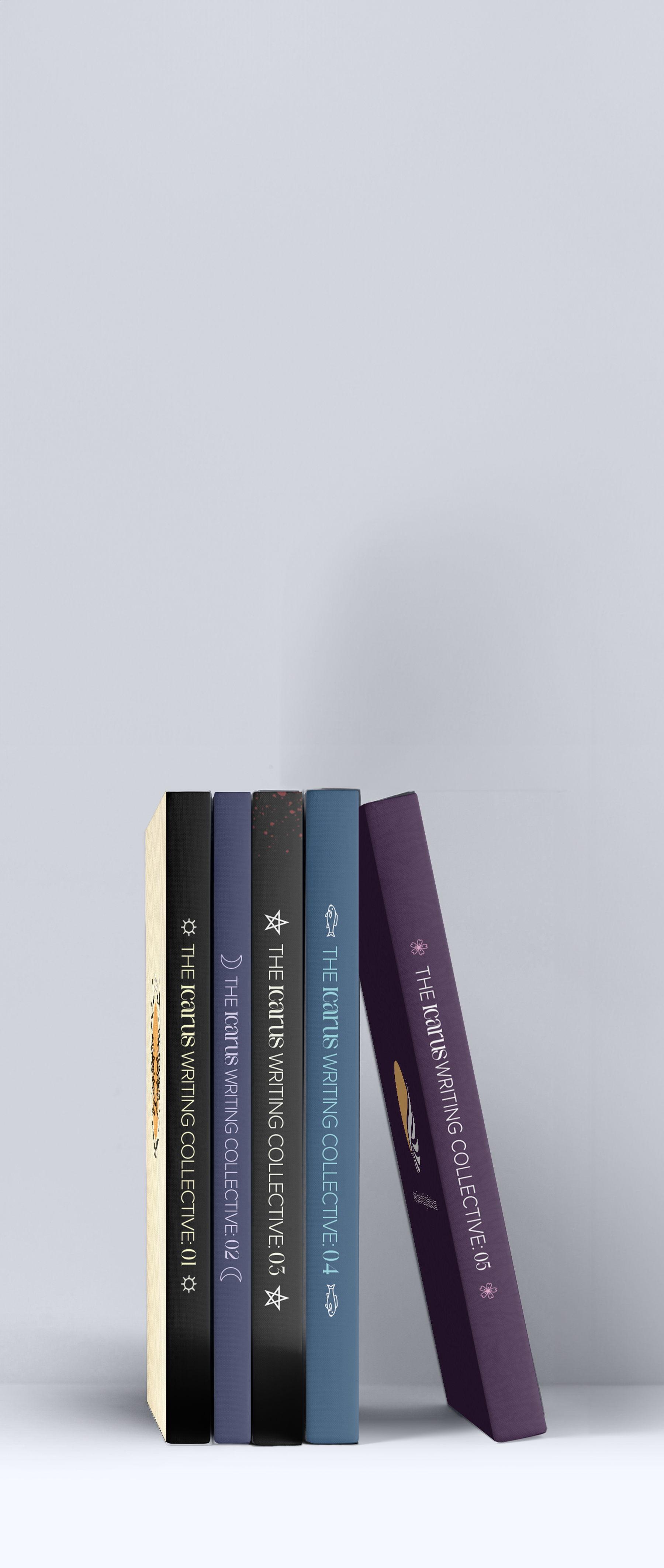
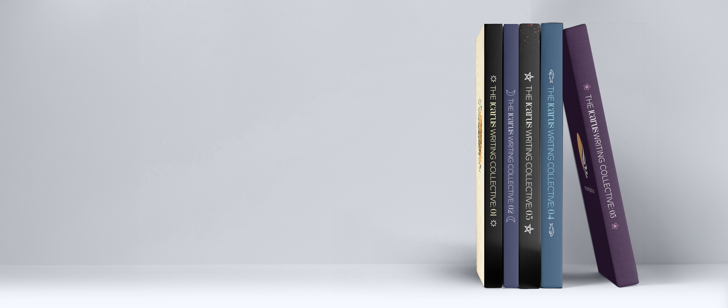
The Icarus Writing Collective is a literary magazine that is dedicated to telling stories that retell, adapt, or transcend literary classics and mythology.
In January 2026, I joined the team as their graphic designer to rebrand their visual identity, art direct future publications, and design the covers, and assist in creating social media content.
The Icarus Writing Collective is a literary magazine that is dedicated to telling stories that retell, adapt, or transcend literary classics and mythology.
In January 2026, I joined the team as their graphic designer to rebrand their visual identity, art direct future publications, design the issue covers, and assist in creating social media content.
rebranding a mythic magazine
the color palette
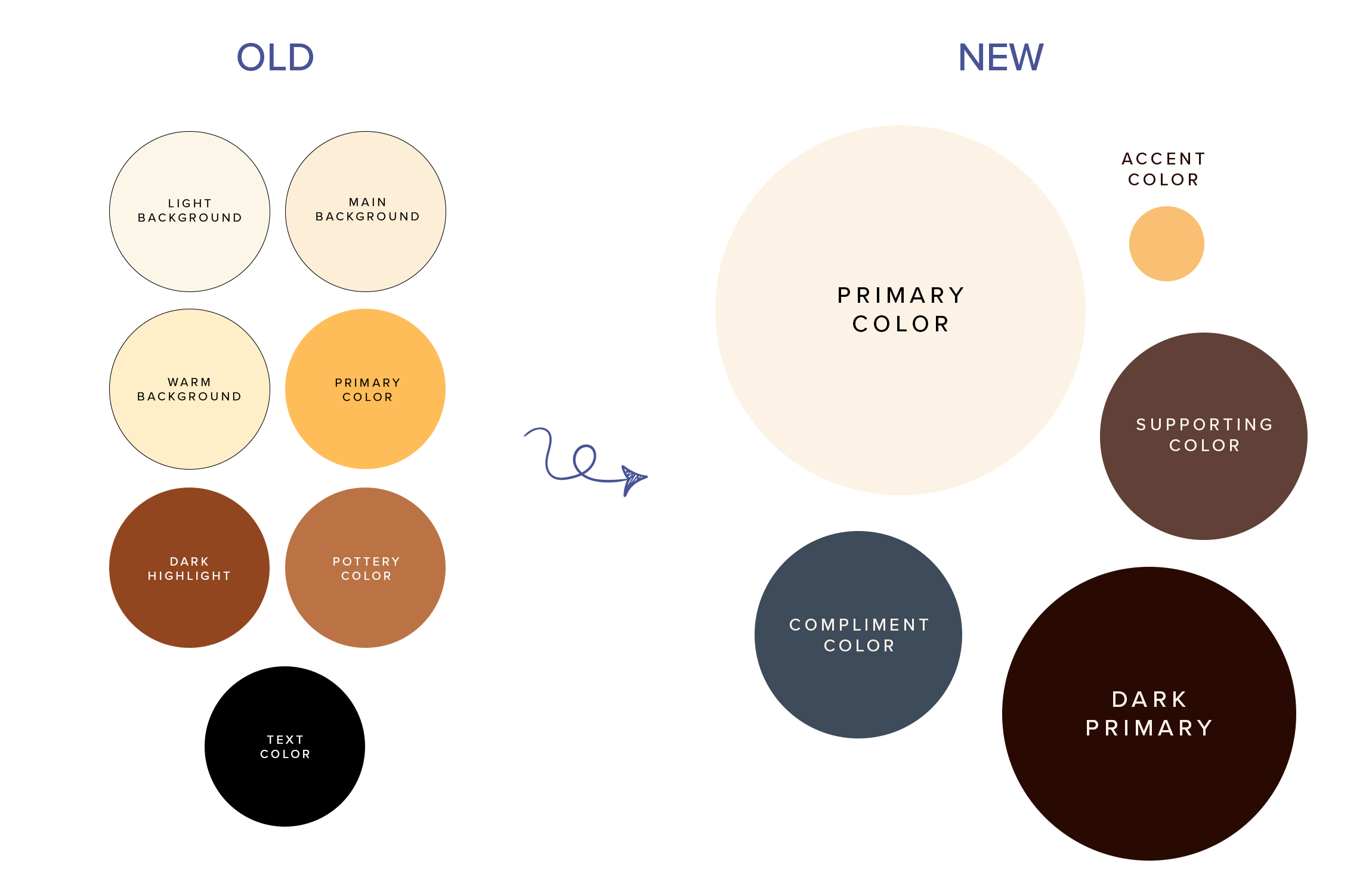
I started the rebrand by refining the brand's color palette to create a more cohesive visual identity, improving contrast, accessibility, and consistency across digital and print applications.
The main change was turning their primary yellow into an accent color, allowing it to really shine and pop in subtle cases, and introducing a shade of denim blue as a compliment to balance the earthy brown tones.
the color palette
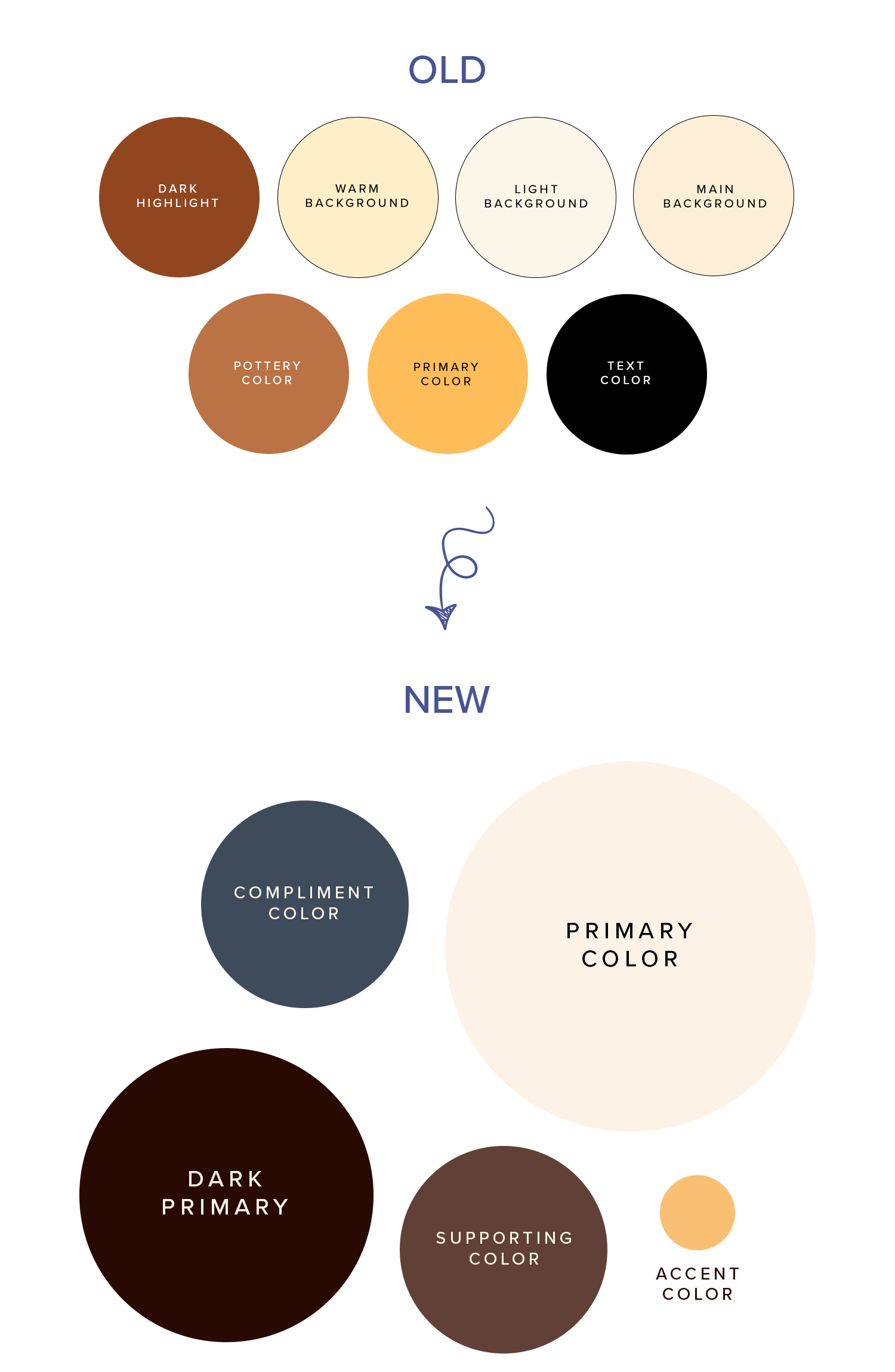
I started the rebrand by refining the brand's color palette to create a more cohesive visual identity, improving contrast, accessibility, and consistency across digital and print applications.
The main change was turning their primary yellow into an accent color, allowing it to really shine and pop in subtle cases, and introducing a shade of denim blue as a compliment to balance the earthy brown tones.
logo refresh
typography with personality
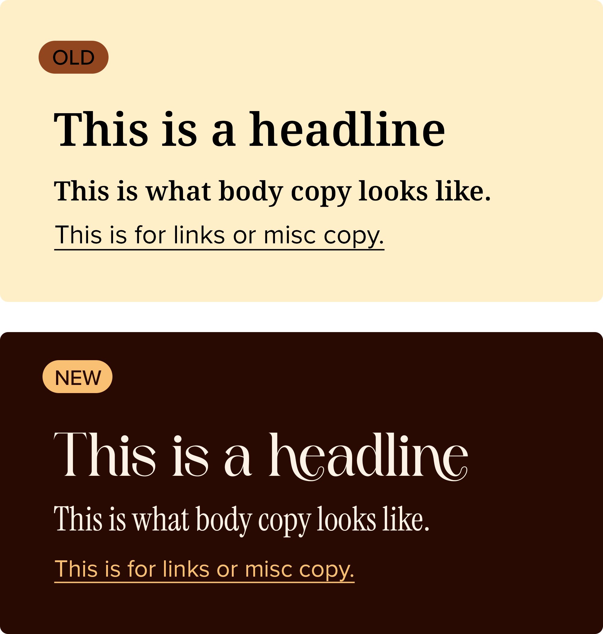
I also introduced a new typography system to be more charming and expressive, creating a more ownable visual identity that feels distinctive, approachable, and memorable.
This also shows how the color palette and typography come together to create more hierarchy.
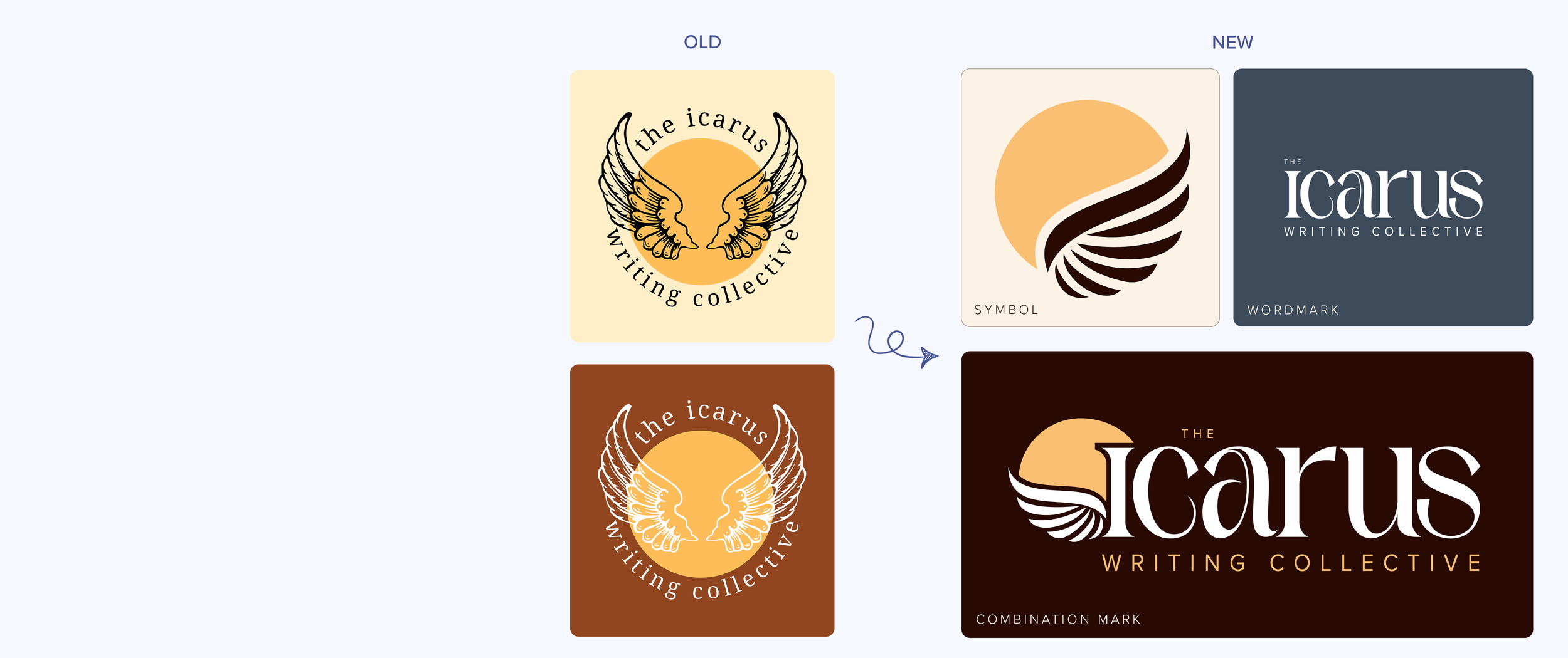
I refined the existing logo to improve clarity, scalability, balance, and versatility while preserving the brand's recognizable identity.
I broke the original logo out into three separate identity types: a symbol for avatar use, a wordmark for simple designs, and a combination mark for website headers.
logo refresh
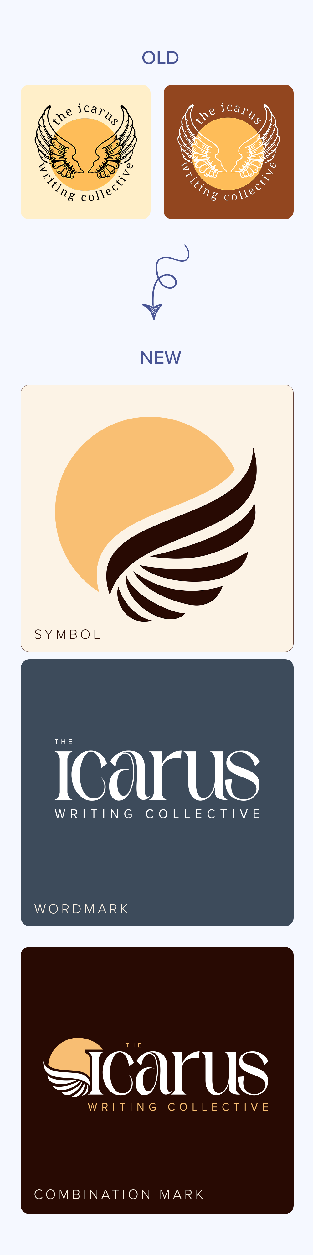
I refined the existing logo to improve clarity, scalability, balance, and versatility while preserving the brand's recognizable identity.
I broke the original logo out into three separate identity types: a symbol for avatar use, a wordmark for simple designs, and a combination mark for website headers.
typography with personality
I also introduced a new typography system to be more charming and expressive, creating a more ownable visual identity that feels distinctive, approachable, and memorable.
This also shows how the color palette and typography come together to create more hierarchy.

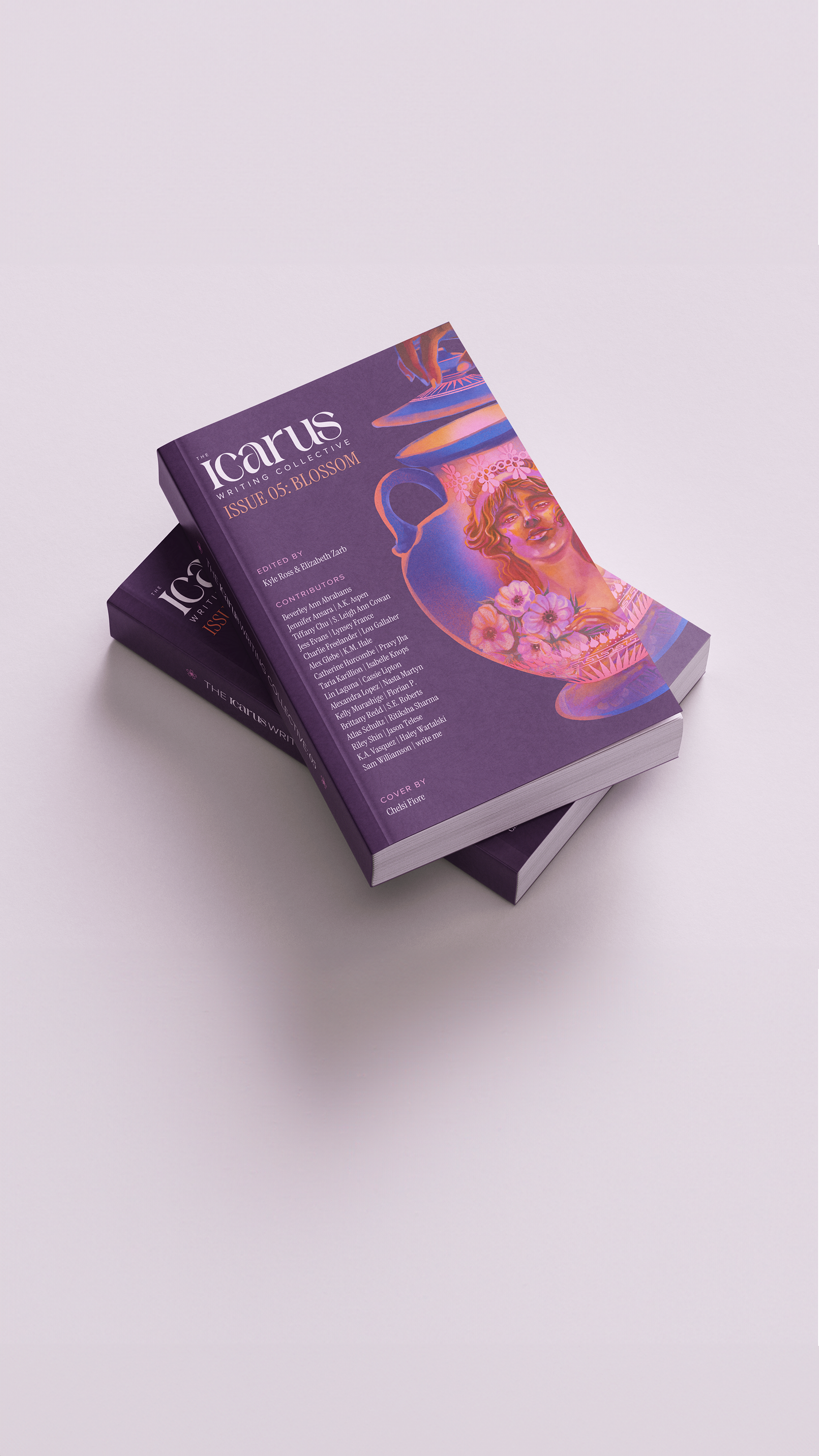
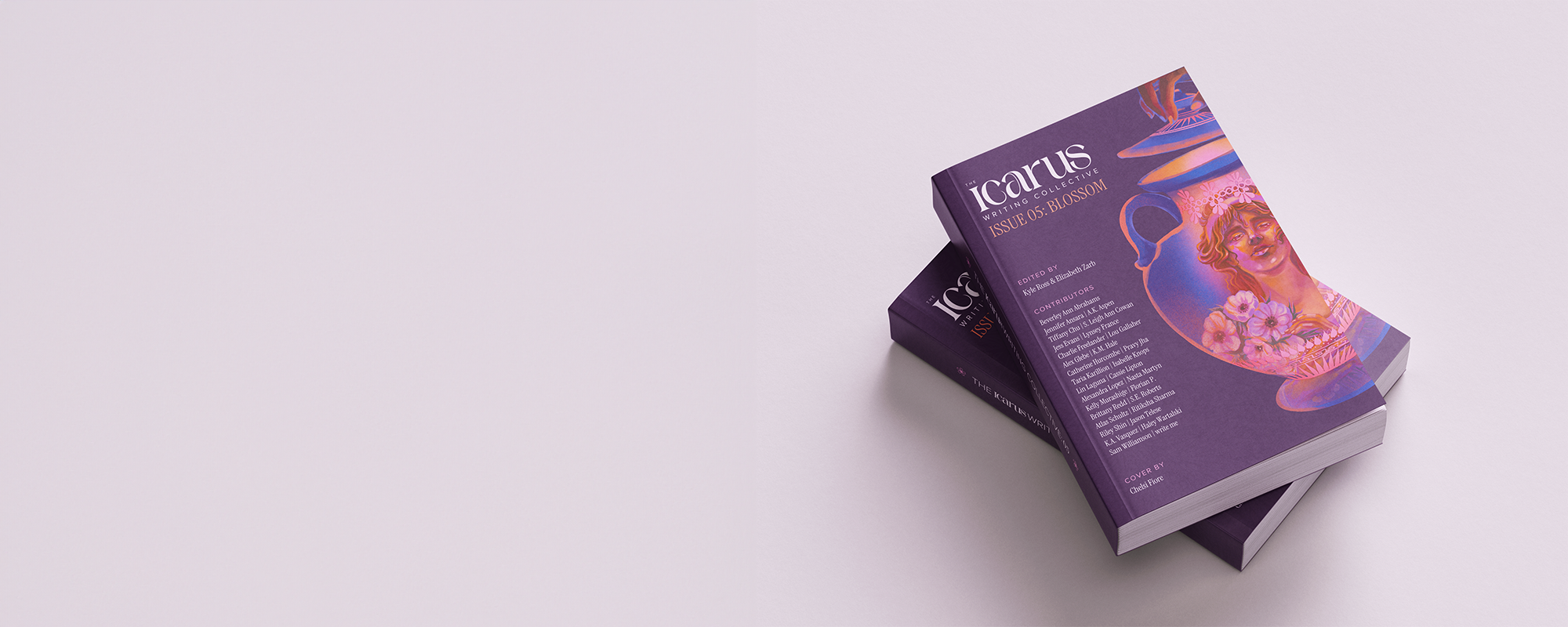
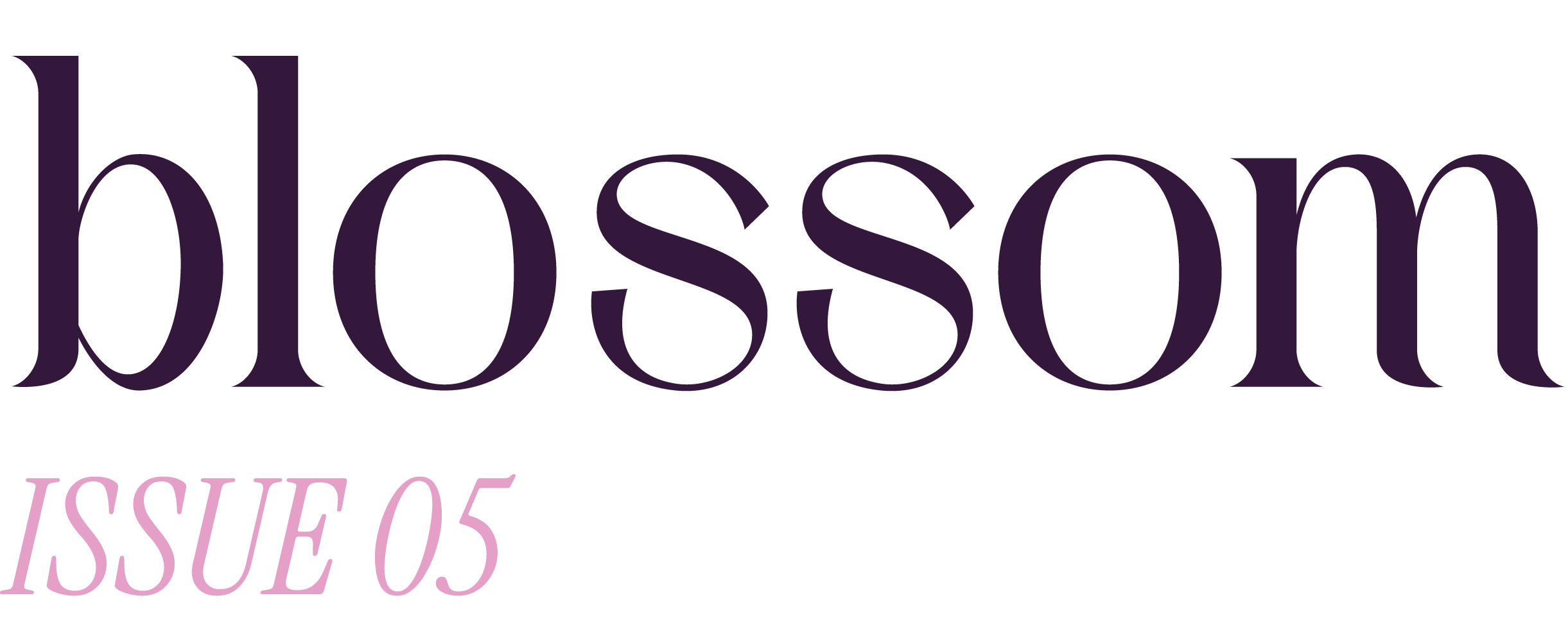
My first issue with the magazine, where I designed the issue cover and supporting social media content to honor each contributor’s writing submission.
My first issue, where I designed the magazine cover and supporting social media content to honor each contributor’s writing submission.

SOCIAL TEASERS
COMING SOON!


merch
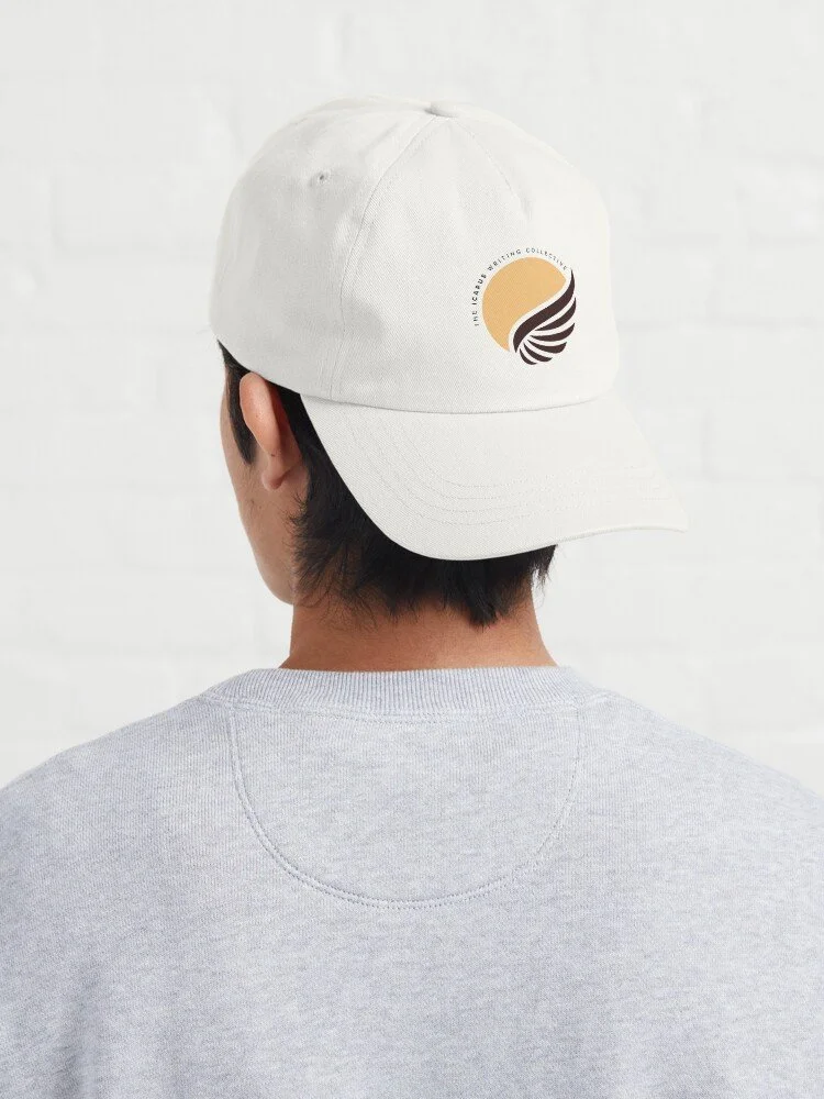
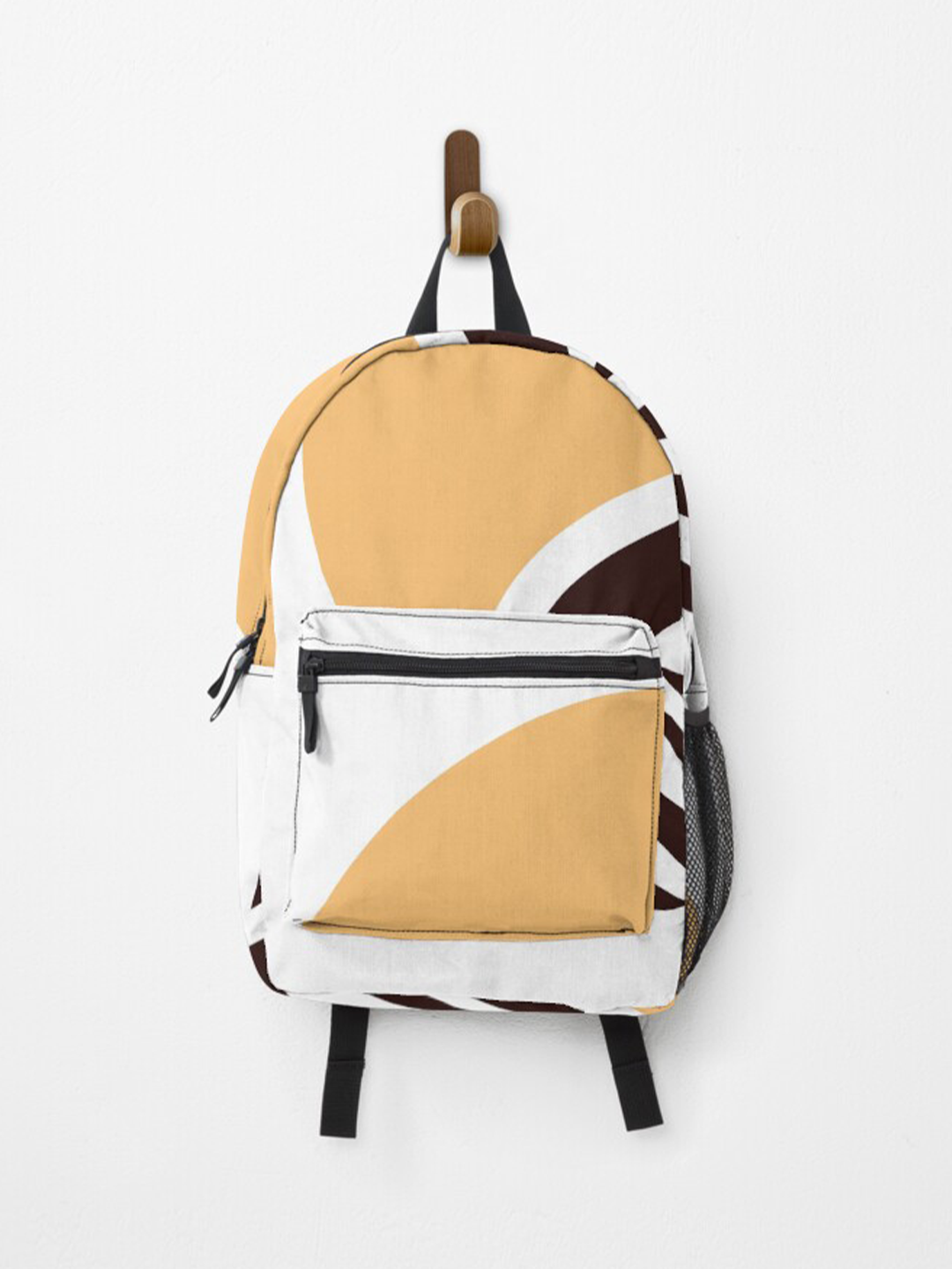
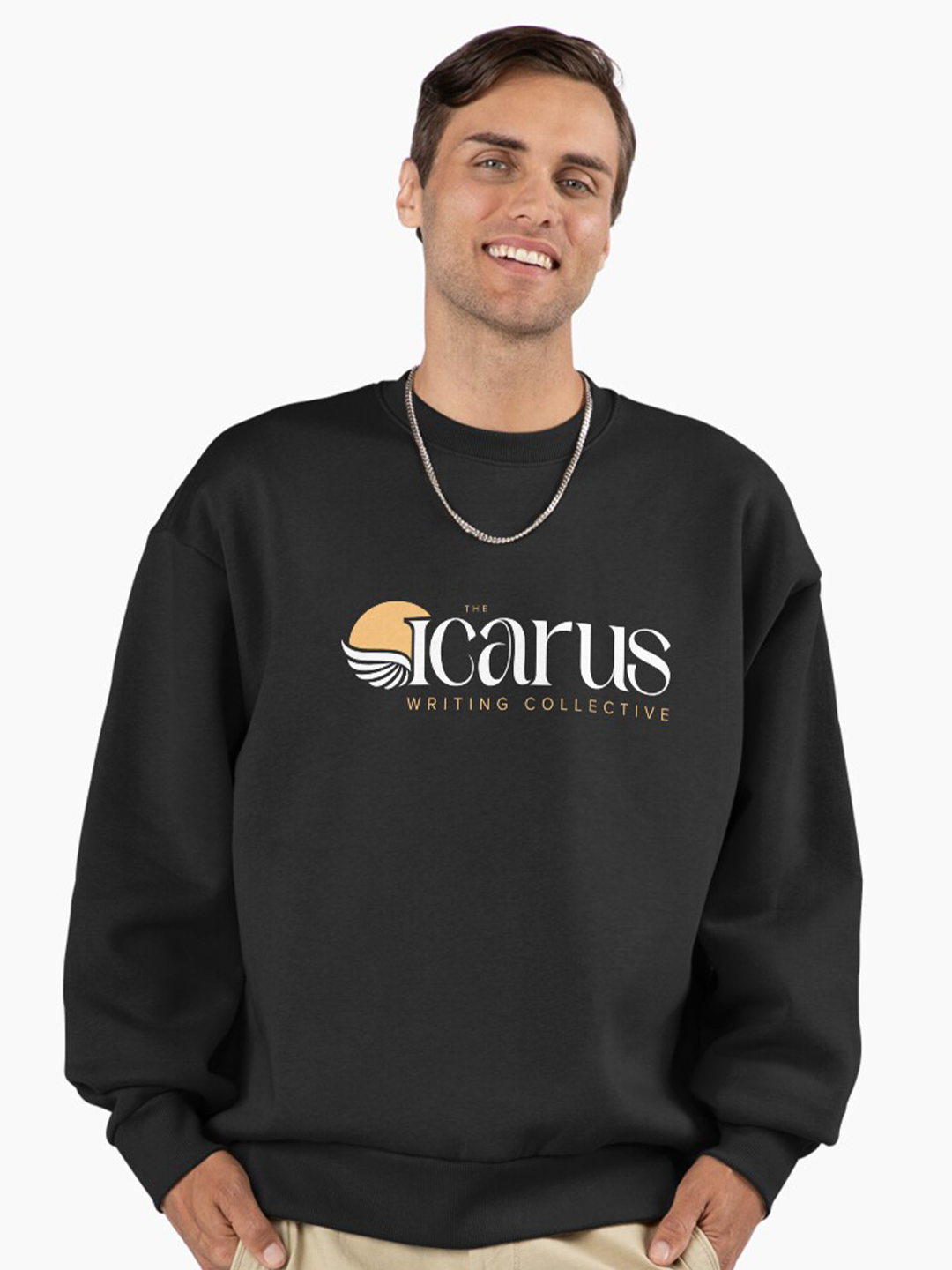
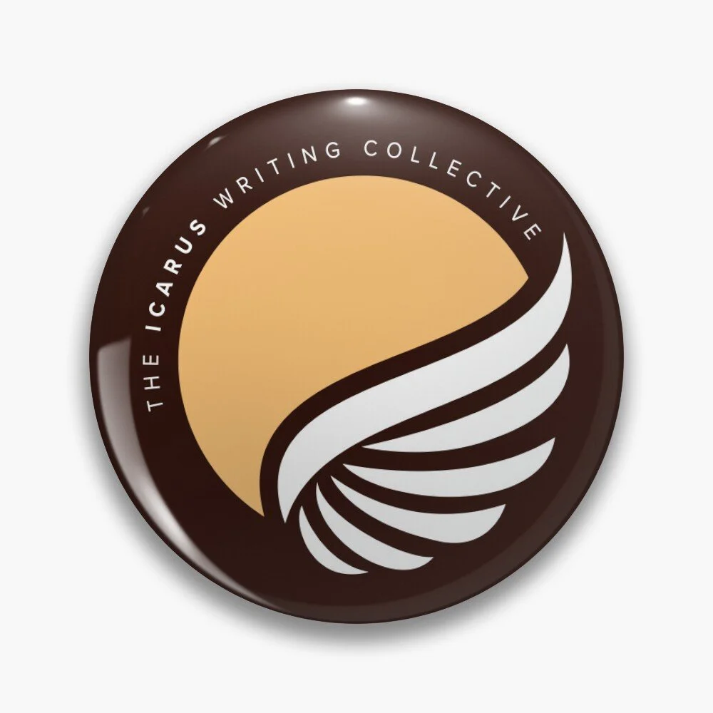
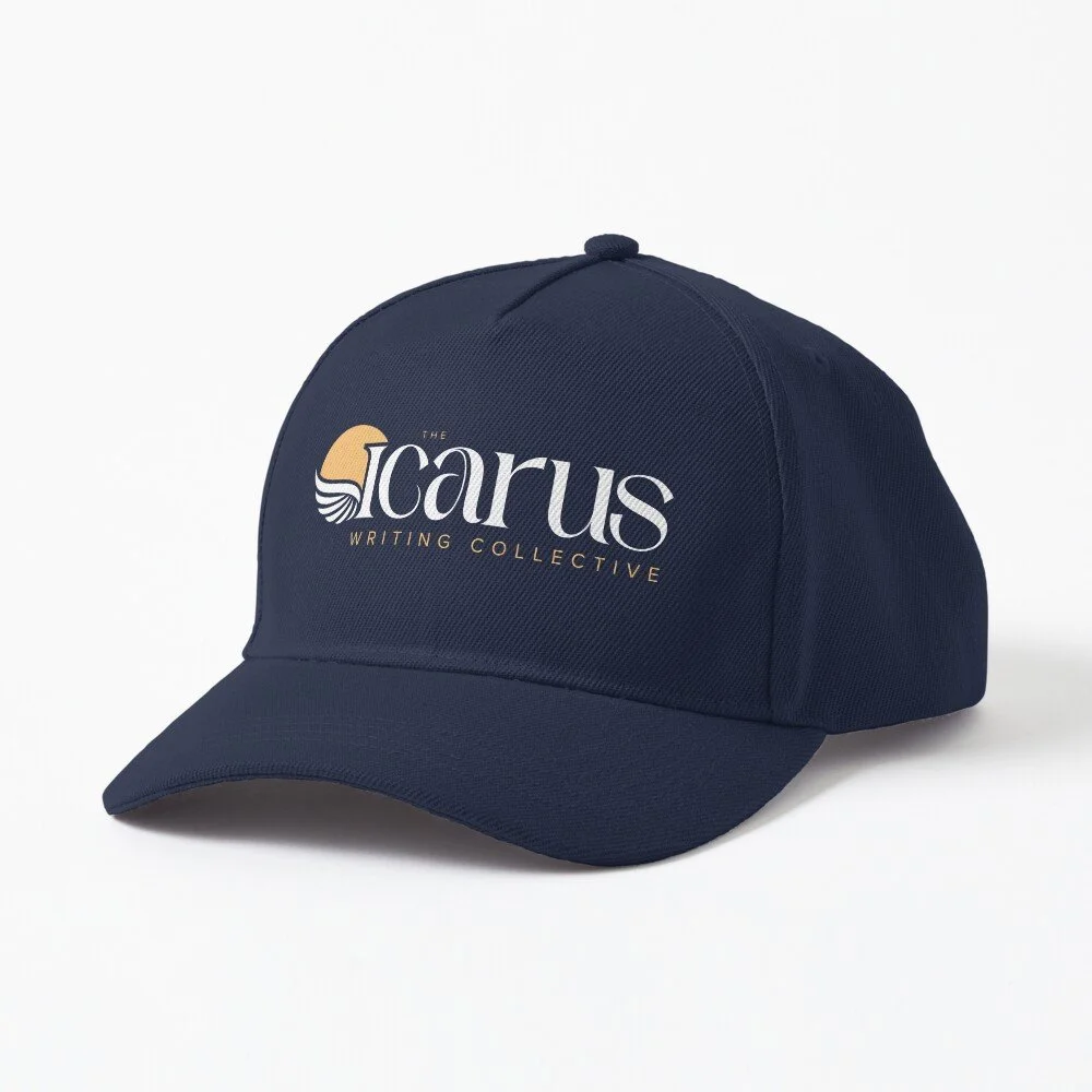
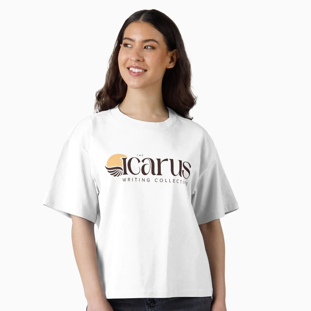
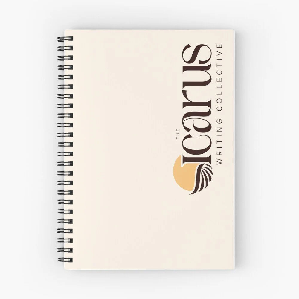
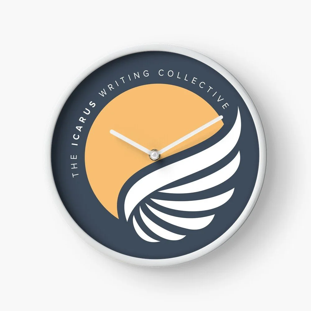
Using the visual elements from the rebrand, I created a number of designs on Redbubble for loyal contributors to purchase their own Icarus merch.
Using the visual elements from the rebrand, I created a number of designs on Redbubble for loyal contributors to purchase their own Icarus merch.